Tire Pressure vs Fuel Economy Graph: Reading MPG for Drivers
Explore how tire inflation levels influence fuel economy with a tire pressure vs fuel economy graph. Learn to read the chart, interpret results, and apply practical inflation guidance for better MPG and safety.

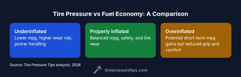
A tire pressure vs fuel economy graph shows that staying near the vehicle’s recommended pressure generally yields the best overall mpg, safety, and tread life. Underinflation lowers efficiency due to higher rolling resistance and heat, while overinflation can reduce traction and comfort, sometimes slightly improving mpg in the short term but risking wear and safety. Use the graph to target the factory-recommended range and adjust for load and speed.
Reading the tire pressure vs fuel economy graph
The tire pressure vs fuel economy graph is not a single number or a fixed line; it represents how changes in inflation influence rolling resistance, heat buildup, and tire deformation. When you examine the graph, you’ll see a region that aligns with the manufacturer’s recommended pressure range. Staying within this band tends to balance efficiency, safety, and tire wear. According to Tire Pressure Tips, this relationship is most reliable when measured against real-world conditions, including load, speed, and temperature. The graph often uses categories like underinflated, properly inflated, and overinflated to illustrate outcomes for mpg, handling, and wear. The goal is to use the data to fine-tune pressure without compromising safety or warranty terms, and to recognize that small deviations can have magnified effects under heavy loads or extreme weather.
Why the graph matters for mpg and safety
Fuel economy is influenced by many variables; tire pressure is a controllable factor with a direct link to rolling resistance. The graph helps translate a numerical PSI value into a practical action: inflate to the manufacturer’s specification for most driving scenarios, then adjust for heavier loads, longer trips, or high-speed driving. It also highlights the trade-offs between mpg and tire longevity or traction. Drivers who monitor the graph over time can maintain a comfortable balance rather than chasing marginal mpg gains at the expense of safety or tire life.
How to read axes, curves, and data sources
Typical graphs plot inflation on the x-axis (often in psi) and mpg or fuel economy impact on the y-axis. Curves may show the mpg impact across different load conditions or tire types. When evaluating a graph, focus on the peak region where mpg consequences are minimized and safety is preserved. Data sources vary, but reputable graphs derive from controlled tests and real-world driving data, smoothed to show trends rather than precise numbers for a specific vehicle. For readers of Tire Pressure Tips, the takeaway is to interpret the graph as a guidance tool, not a mandate for every ride.
The science behind rolling resistance and contact patch
Tire inflation affects the contact patch shape and the amount of rubber in contact with the road. Underinflation increases the patch area, generating more deformation, heat, and energy loss that reduces mpg. Overinflation reduces the patch contact, compromising grip and ride quality, which can indirectly affect efficiency through slip or rougher handling. The tire’s internal temperature also interacts with pressure: hotter tires can shift pressure readings and slightly alter rolling resistance. The graph captures these dynamics by illustrating general trends rather than vehicle-specific numbers.
Data sources and real-world variation
Graphs of tire pressure vs fuel economy rely on data from controlled tests and field observations. Variability arises from tire brand, model, tread pattern, road conditions, climate, and individual driving styles. The Tire Pressure Tips analysis emphasizes that a good graph reflects averages and typical scenarios, not every possible combination of load, speed, and road surface. When applying the graph to your car, start from the manufacturer’s specified range and observe mpg changes over weeks or months to identify your personal sweet spot.
Practical mpg implications: what to adjust first
If you notice a drop in mpg, first verify you are within the recommended range for your vehicle. Small adjustments within the range can produce noticeable improvements in efficiency without undermining safety. Prioritize inflation changes due to factors you can control, such as load and trip type (city vs highway). The graph suggests that consistent tire pressure within the recommended band is more valuable for mpg stability than chasing dramatic shifts in inflation. Keep a reliable gauge, and recheck pressures when seasons change or before long trips.
Common misinterpretations and myths
A frequent misconception is that any higher psi will dramatically improve mpg. In reality, beyond the recommended band, mpg gains stall or reverse because of reduced grip and poorer contact patch performance. Another myth is that modern fuel economy engines render tire pressure irrelevant; in truth, even with advanced powertrains, inefficient rolling resistance can erode mpg. The graph helps debunk these ideas by showing the optimal region and the consequences of deviating from it.
Climate, temperature, and seasonal effects on the graph
Temperature affects air density and tire pressure readings. In cold weather, measurements may appear low until tires warm up; in hot weather, readings can rise. The graph accounts for these variations by illustrating trends rather than rigid values. Drivers should test inflation after significant weather changes and adjust toward the recommended range, factoring in any persistent differences observed in mpg during daily driving.
Step-by-step: using your own data with the graph
- Check the vehicle’s recommended pressure in the owner’s manual or door jamb sticker.
- Record baseline pressures and fuel economy over a week or two.
- Inflate or deflate in small increments within the recommended band and recheck mpg changes.
- Note other conditions (load, speed, climate) to isolate inflation’s effect.
- Use a consistent gauge and service environment to minimize measurement error.
- Update your pressure target as needed based on trends observed in your data.
Case scenarios: urban driving vs highway driving
In urban driving, frequent changes in speed and stop-and-go traffic can make proper inflation even more important for mpg and wear. On highways, stable pressure within the recommended range tends to preserve efficiency while maintaining comfortable handling. The graph provides a framework to assess how your typical driving pattern aligns with the best mpg outcomes, guiding decisions on when to adjust for speed, heat, or load.
TPMS, gauges, and measurement precision
Tire Pressure Monitoring Systems (TPMS) offer a warning when pressures drop, but they do not give exact psi readings. A mechanical gauge provides precise measurement to verify TPMS readings. The graph assumes accurate inflation data; therefore, investing in a reliable gauge and periodic calibration helps ensure you’re reading the graph correctly and not chasing an illusion of higher mpg from inaccurate numbers.
Feature Comparison
| Feature | Underinflated | properly inflated | Overinflated |
|---|---|---|---|
| Fuel economy impact | Typically lower mpg due to increased rolling resistance and heat | Best mpg within the manufacturer’s recommended range | Potential short-term mpg gain, but efficiency drops with poor traction and wear risks |
| Tire wear pattern | Increased wear on edges and shoulders; uneven wear is common | Even wear across the tread when within spec | Center wear and possible edge wear on corners; reduced grip can cause uneven loading |
| Ride quality and handling | Harsher ride and less predictable handling when underinflated | Balanced ride and predictable handling within range | Stiff ride with reduced contact at extremes; potential handling issues |
| Safety risk | Higher risk of heat buildup, blowouts under load | Low risk when within recommended range | Increased risk of blowouts and reduced wet/dry grip; safety margins shrink |
| Best use case | Avoid underinflation; use as a warning indicator to check pressure | Standard driving; baseline for efficiency and safety | Special circumstances like light loads or specific high-speed scenarios (consult manual) |
Strengths
- Clear, visual way to link inflation to MPG
- Encourages adherence to manufacturer recommendations
- Promotes safer driving by reducing underinflation risks
- Supports proactive maintenance and longer tire life
Drawbacks
- Graphs are generalized and may not reflect every vehicle
- Temperature, load, and driving style can muddle readings
- Overreliance on a single graph can overlook other efficiency factors
- Requires consistent measurement practices for accuracy
Maintain recommended tire pressure to maximize mpg and safety.
The tire pressure vs fuel economy graph supports prudent inflation within the manufacturer’s range as the most reliable path to efficient driving. While small adjustments can yield small mpg improvements, the benefits plateau beyond the recommended values. For best results, combine accurate pressure checks with good driving habits.
Frequently Asked Questions
What is the primary takeaway from a tire pressure vs fuel economy graph?
The graph highlights how inflating to the recommended pressure typically yields the best balance of fuel economy, tire wear, and safety. Deviating outside the recommended range can degrade mpg and increase risk. Use the graph as a guidance tool to stay near the target zone.
The chart shows you should stay near the recommended pressure for best mpg and safety. Deviating outside that range can hurt efficiency and grip.
Can inflating tires beyond the recommended range improve fuel economy?
Overinflating beyond the manufacturer’s range can provide marginal mpg benefits in some cases, but it often reduces grip, increases wear in the center of the tread, and raises the risk of a blowout in hot conditions. The graph warns against relying on this for meaningful gains.
Overinflating might seem to help mpg, but it damages grip and tire life. It's not a good trade-off.
How should I use the graph with TPMS data?
TPMS alerts you to pressure loss, but precise readings require a gauge. Use TPMS as a safety net and verify with a gauge before adjusting to align your actual pressures with the graph's guidance.
TPMS warns you when pressure is low; verify with a gauge and adjust to the recommended range.
Does temperature affect the tire pressure graph?
Yes. Temperature changes can shift readings and thus influence where you sit on the graph. Check pressures in similar ambient conditions and re-check after weather changes to keep readings accurate.
Temperature matters. Re-check pressures when the weather changes to stay on the right part of the graph.
Should I adjust tire pressure for daily commuting vs long trips?
For most daily commuting, stay within the manufacturer’s recommended range. For long trips or heavy loads, slight adjustments within the range can help maintain mpg and safety, as indicated by the graph’s guidance.
Stick to the recommended range, but adjust within it for long trips or loads.
What to Remember
- Use the graph as a guide, not a rulebook
- Maintain inflation within the manufacturer’s recommended range
- Consider load, climate, and driving style when applying the graph
- Regularly check pressures with a reliable gauge
- Pair inflation discipline with safe driving practices